welcome to my site
On this site I will post pictures of my drafts I made for my final magazine 'Fresh'. Creating drafts for the magazine was useful as when creating the final product time wasn't wasted as I knew how I wanted the layout, and I just had to simply insert specific elements.
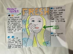
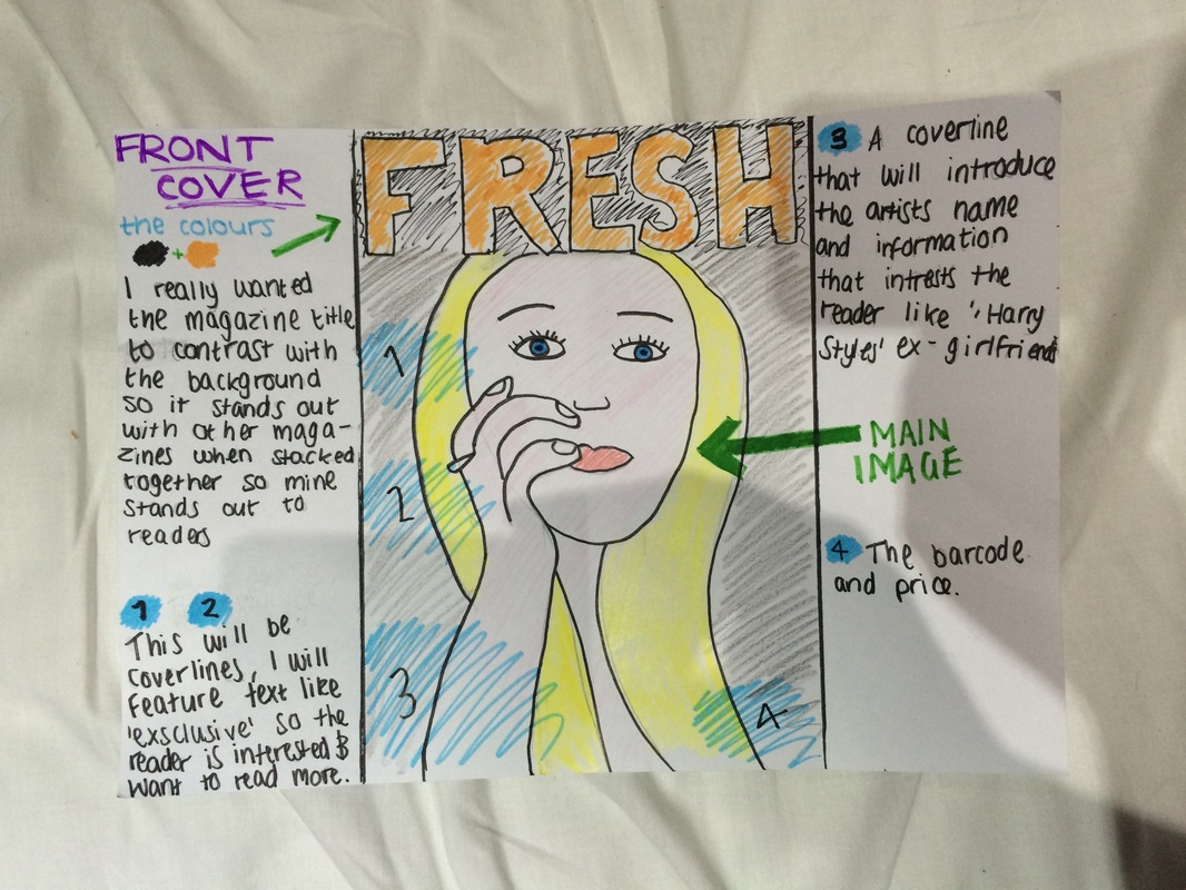
Draft for the front cover.
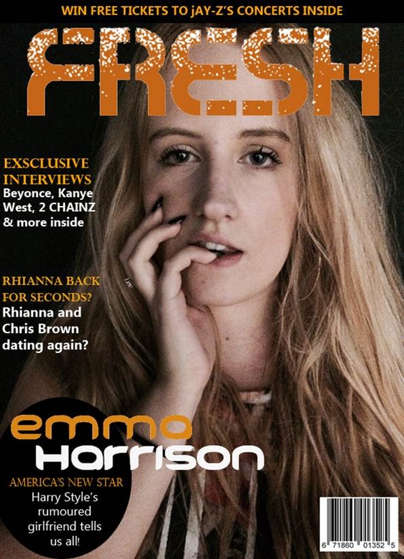
From the beginning I always wanted to use two contrasting colours for the front cover, as I feel it's eye-catching and stands out when stacked with other magazines. I also feel it suits our target audience as it's a slight contrast and doesn't look immature. I also wanted the front image to be a close-up, I feel this broke the stereotypical 'rapping image' as my artist is a rapper/singer. I think this because rappers are normally seen surrounded by women/men in minimal clothing, and the audience never get to see the rapper in a vulnerable state, which I feel is what a close-up does to an artist, as it's so close to the artists face and communicates 'there's nothing to hide'. Before creating the draft I wanted to have cover lines on both sides of the main image, but when looking at my chosen image, I found text was hard to read on the right side as the models hair is in the way, which wasn't a big problem as I quite liked the minimal cover lines as it's mysterious for the readers as they want to know whats inside, so having less cover lines 'lures' the audience in.
From the beginning I always wanted to use two contrasting colours for the front cover, as I feel it's eye-catching and stands out when stacked with other magazines. I also feel it suits our target audience as it's a slight contrast and doesn't look immature. I also wanted the front image to be a close-up, I feel this broke the stereotypical 'rapping image' as my artist is a rapper/singer. I think this because rappers are normally seen surrounded by women/men in minimal clothing, and the audience never get to see the rapper in a vulnerable state, which I feel is what a close-up does to an artist, as it's so close to the artists face and communicates 'there's nothing to hide'. Before creating the draft I wanted to have cover lines on both sides of the main image, but when looking at my chosen image, I found text was hard to read on the right side as the models hair is in the way, which wasn't a big problem as I quite liked the minimal cover lines as it's mysterious for the readers as they want to know whats inside, so having less cover lines 'lures' the audience in.
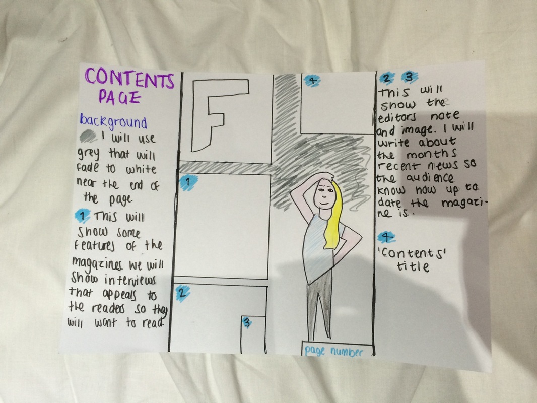
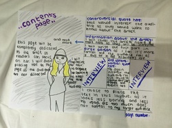
Draft for the contents page.
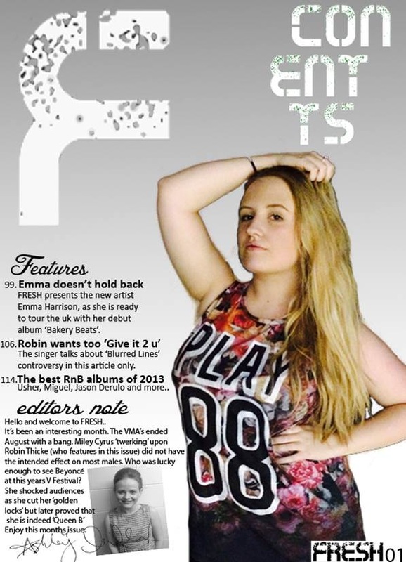
This page was easier to plan as I was inspired by various pages, and I didn't have to include a lot of text on this page. I wanted to include a 'snippet' of the masthead on the page, so the audience were reminded that they were reading a 'Fresh' magazine. Also I included it for copyright, for example if this page was to be used online the audience would know the page is from our magazine which is great advertisement. I was always keen on including an editors note because I myself read magazines, and I like reading the editor's note as I feel as if I know the editor and it's more directed to me as an audience member. When writing the note I wrote about recent events so the audience knew how recent the magazine was. I wanted to include a picture of the editor, and decided last-minute to include a signature from the editor to make it more special, and I feel it looks more professional as signatures are used rarely.
This page was easier to plan as I was inspired by various pages, and I didn't have to include a lot of text on this page. I wanted to include a 'snippet' of the masthead on the page, so the audience were reminded that they were reading a 'Fresh' magazine. Also I included it for copyright, for example if this page was to be used online the audience would know the page is from our magazine which is great advertisement. I was always keen on including an editors note because I myself read magazines, and I like reading the editor's note as I feel as if I know the editor and it's more directed to me as an audience member. When writing the note I wrote about recent events so the audience knew how recent the magazine was. I wanted to include a picture of the editor, and decided last-minute to include a signature from the editor to make it more special, and I feel it looks more professional as signatures are used rarely.
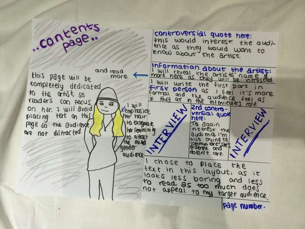
Draft for the double page spread.
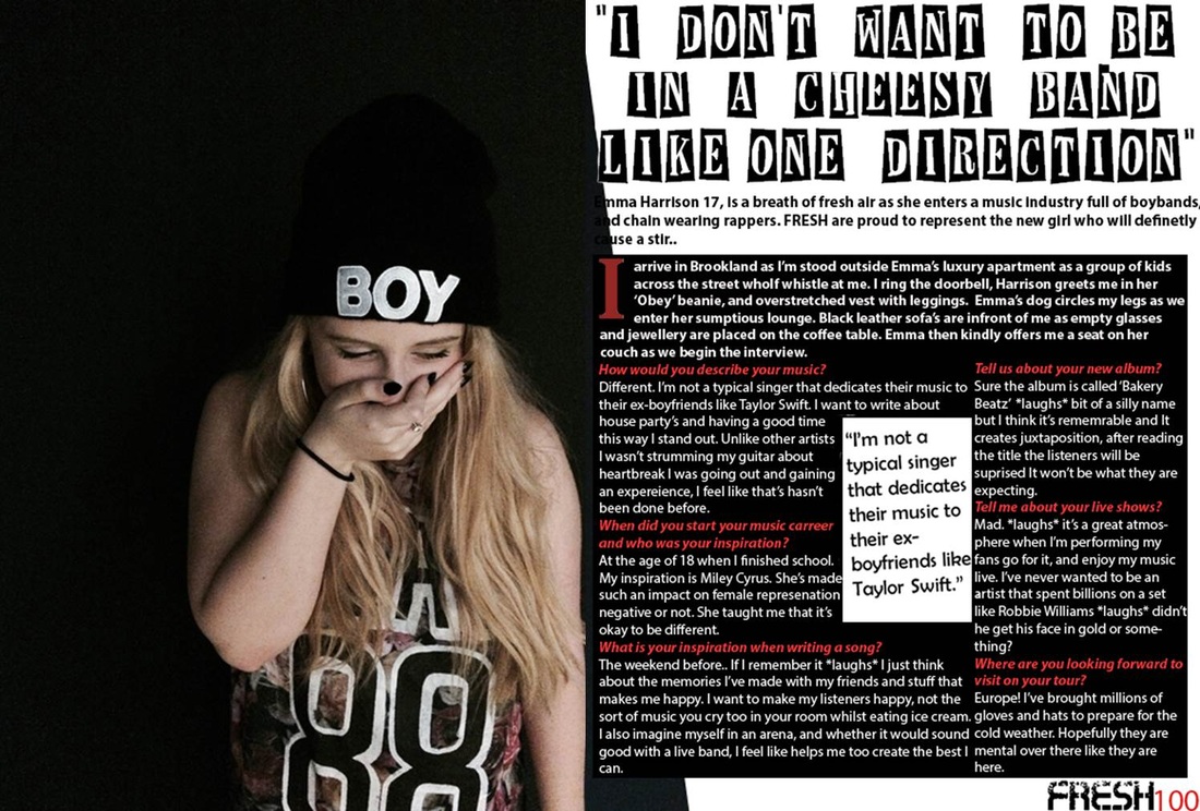
When researching on other music magazines I found they dedicated the left page to the artist, so the page would simply be an image of them. I used this idea, but I wanted to really dedicate the page to Emma as she's a new artist and I felt this was more special and the audience members would want to read about her, so I didn't include text on this page. For example, instead of placing her name on the left page I did it on the right so the audience HAD to read the page to find out more about her, this meant they would read the full interview. I made part of the interview in first person as I felt the audience could imagine themselves as me in the interviewers role, which is quite special and fun. The layout of my interview was different as I put the text in a 'square' layout. This makes it more interesting and looks like theres less text, as I feel most readers are put off by big paragraphs so I wanted to make sure they would read this page. Lastly, I included controversial quotes as this made the page more 'debatable' and readers would want to know why she said such things. Also this makes her more different as she isn't scared to voice her opinion unlike other celebrities, which means she has a 'I don't care' persona which teenagers could relate too.
When researching on other music magazines I found they dedicated the left page to the artist, so the page would simply be an image of them. I used this idea, but I wanted to really dedicate the page to Emma as she's a new artist and I felt this was more special and the audience members would want to read about her, so I didn't include text on this page. For example, instead of placing her name on the left page I did it on the right so the audience HAD to read the page to find out more about her, this meant they would read the full interview. I made part of the interview in first person as I felt the audience could imagine themselves as me in the interviewers role, which is quite special and fun. The layout of my interview was different as I put the text in a 'square' layout. This makes it more interesting and looks like theres less text, as I feel most readers are put off by big paragraphs so I wanted to make sure they would read this page. Lastly, I included controversial quotes as this made the page more 'debatable' and readers would want to know why she said such things. Also this makes her more different as she isn't scared to voice her opinion unlike other celebrities, which means she has a 'I don't care' persona which teenagers could relate too.